Microsoft
MSN and Copilot.
MSN
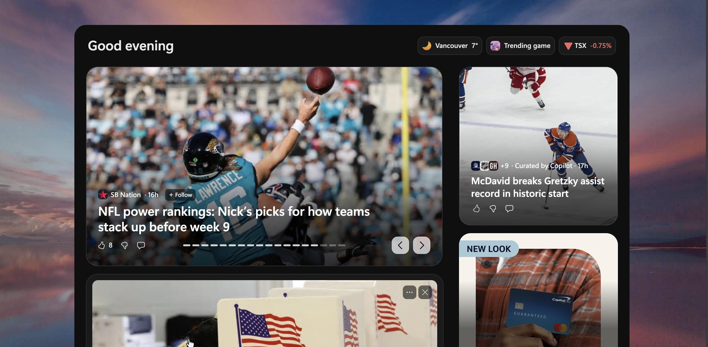
I design new experiences for the MSN news feed within Microsoft AI.
Building with AI
Our team uses AI-first workflows to develop and ship new features.
Copilot
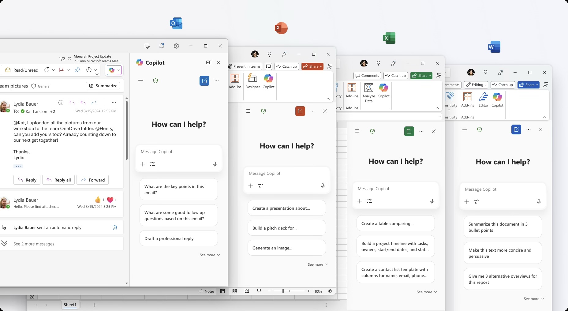
My earlier work on Copilot covered suggestions and settings, from finding a useful starting point to managing connected services.
Settings across partners and plugins
I worked on the UX and UI for Copilot’s settings. With so many partners and plugins to account for, it was a substantial undertaking. The challenge was to give people a clear, consistent way to find and manage their connected services.
A useful starting point
People didn’t know what to do with Copilot. An open prompt box offered plenty of freedom, but it also asked them to figure out the product before they had tried it. I explored suggestions grounded in familiar work: reviewing a document, building out a presentation or preparing for a conversation with a colleague.
Relevant suggestions, less noise
The early direction used an explorable layout with rich previews, familiar files and close connections. It was well received in team reviews, while engineering raised concerns. Testing gave us a clearer steer: people weren’t scrolling or browsing the suggestions, and some prompts performed poorly. I focused on the stronger prompts and dialled back the previews.
Giving the input room
Later testing showed more interaction with suggestions, although people still used the input more. That changed the balance of the page. I made the input the focus and toned down the surrounding content, keeping suggestions available without letting them compete for attention.
The final suggestion design
The final suggestion design received approval from design, engineering and stakeholders before handoff. The reported click-through rate was 10–14%.
Responsive interface exploration